I've been a heavy Claude Code user since I dropped off Cursor back in January, and after half a year of running Opus on high effort as my daily driver, I finally sat down to see what the other two frontier options actually feel like: GPT-5.6 Sol inside Codex, and GLM-5.2 inside Cursor. This is a first pass, not a benchmark. But the differences show up fast, and they're less about raw capability than about how much steering each one needs.
Why I stuck with Claude Code
Claude Code with Opus has been reliable in a specific way: I know where the edges are. Tell it to do something and I generally know the outcome before it runs. That predictability is worth a lot, even through Anthropic's downtime and the occasional sense that a model's behavior shifted underneath me. Reliability beats novelty when the tool is load-bearing.
Curiosity won anyway. Both Sol and GLM-5.2 have a lot of hype around them, so both are getting a real trial on real work.
GLM-5.2 in Cursor
The initial, unscientific impression of GLM-5.2 is that it's good. Call it 75 to 80% as capable as Opus 4.8. It gets things done without much intervention and mostly stays on the rails, though it sometimes wanders down an implementation path that needs correcting.
Two confounders help it, and I want to be honest about them. One, Cursor is a good harness. Two, our team runs an extensive developer harness module: skills, documentation, helper scripts, a large pile of team-specific context that gives any model an edge. How GLM-5.2 would perform naked, hitting the API through a simpler agent, I genuinely don't know.
One habit across all of this: force thinking as high as the tool allows. Not max, usually the tier just under it, like high.
GPT-5.6 Sol in Codex
Sol on high thinking seems reasonable on capability. The problem so far is inertia.
Ask it to do something, or suggest something be done, and it says sure, it can do that. Say "okay, go do it," and it says yes, it can absolutely do that. Then I have to say, explicitly, no, go do the thing, now. It reads the letter of what you wrote and pays less attention to the intent behind it, so you have to give it more direct instructions than I'm used to giving.
That friction is hindering my evaluation more than any capability ceiling is. I'll keep pushing on it, because the pedantry might just be a prompting problem on my end.
Where I've landed for now
Big tasks and anything that needs writing, design docs, blog posts, stay in Claude with Opus. Small and medium tasks get delegated out to Cursor and GLM-5.2. Sol stays in the rotation as an experiment until I figure out whether the inertia is the model or me.
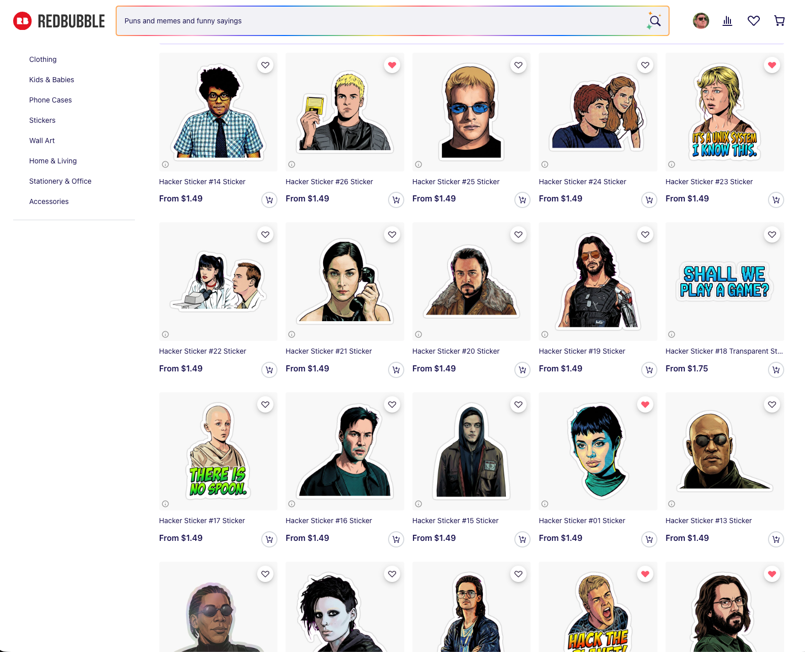
Last week I made a series of hacker stickers. Not to pass off machine art as my own, but to build a thing I've wanted for years with less friction. Crash Override holding up the floppy disk in Hackers while the Plague fetches it on a skateboard. Lex in Jurassic Park saying "this is Unix, I know this." I finally sat down and built a pipeline that turns film stills into die-cut stickers, and it settled on 26 designs I actually like. They're online here, at cost, 0% markup.
Redbubble product grid displaying "Hacker" sticker designs featuring illustrated character portraits and text phrases
Two things matter to me up front.
I'm never trying to create art with AI and pass it off as human-made. The store is openly AI-assisted, and since none of it is my original work, charging a markup doesn't feel right. Cost only.
And the taste stays human. Our squishy brains still control the direction. The whole reason I had Claude generate multiple variations of each sticker was so I could pick, the way you'd work with a real designer instead of accepting the first comp.
Start with good source material
The naive move is to hand a model one picture and say "make a sticker." That's not what this was.
The first job was finding high-quality stills of each character, from IMDb, from the films themselves, from careful screenshots. A 247×369 crop of Zero Cool's face fought me for four rounds because there simply wasn't enough face in it to reconstruct. Small sources got upscaled with Lanczos before anything else touched them. Garbage in, garbage sticker.
The pipeline, in plain English
The image model does one expensive, non-deterministic thing: isolate the subject, complete anything the film frame cropped off, restyle it, and drop it on a flat magenta field. That render gets cached.
Everything after that is ImageMagick, deterministic and free. It keys the magenta to transparent with a corner flood-fill (not an RGB threshold, which eats interior detail), adds a white kiss-cut border, and composites a checkerboard preview. Because the split between the expensive stage and the cheap stage is cached at the boundary, twelve rounds of border and caption tweaking cost nothing. No API calls to nudge a keyline 4 pixels.
The model was gemini-3-pro-image-preview, about $0.13 an image. Total spend across roughly 125 renders came to around $16. Bun and TypeScript for the orchestration.
Have the agent build you a way to look
The most useful thing I asked Claude for wasn't the stickers. It was a review tool.
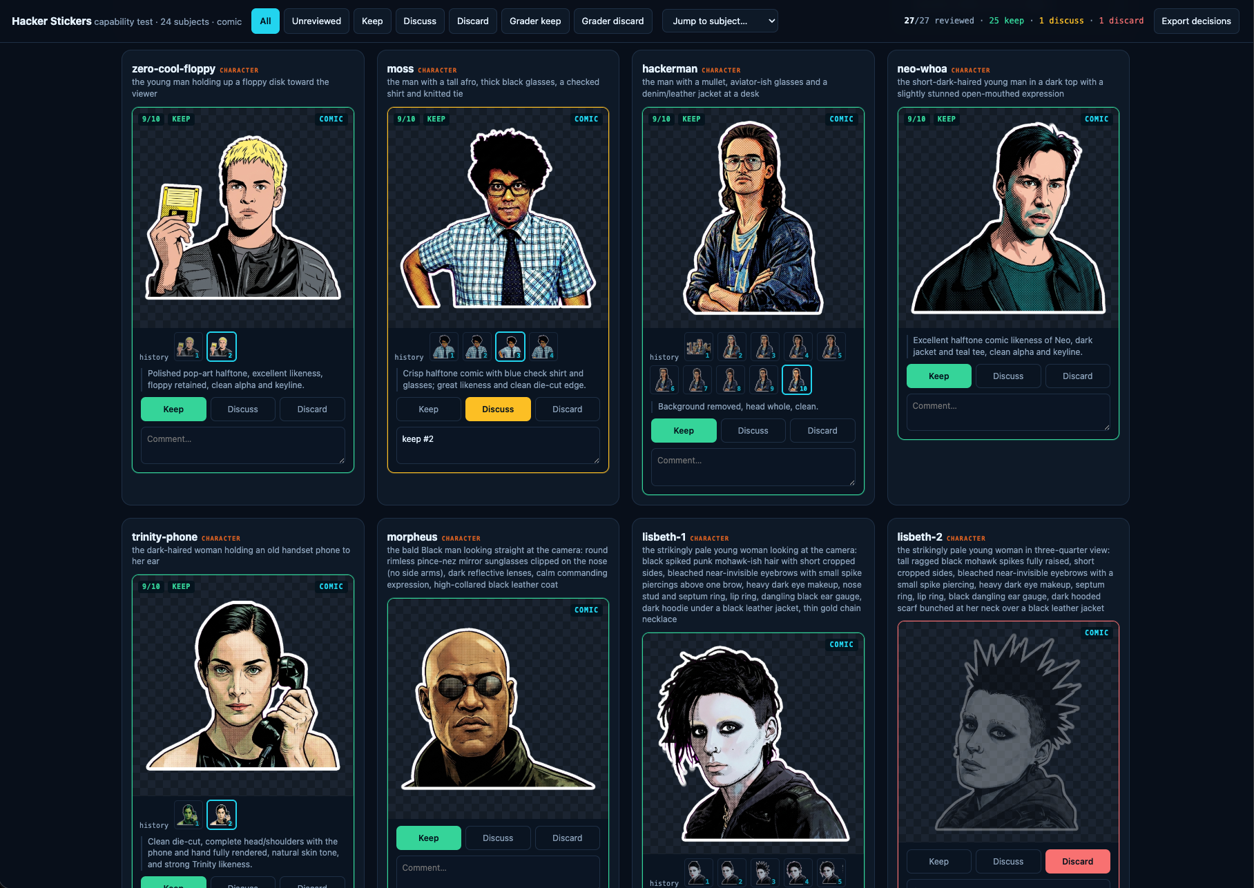
A little local web server on port 4330, one card per subject, verdict buttons, free-text notes. Below each image, a version stepper. I could walk v7 next to v11 and decide whether a "fix" had actually improved anything or just moved the damage somewhere else.
Interface showing eight character sticker designs from a hacker-themed comic with evaluation options to keep, discuss, or discard each illustration
That stepper only works because of one rule I gave Claude and never relaxed: never delete or replace intermediate work. Every version is snapshotted, append-only, deduped by hash. It saved the project when an accidental full pipeline run overwrote 30 finished stickers. Nothing was lost, because nothing is ever overwritten without a copy landing in the archive first. Build that before you need it.
The style chose itself
I assumed these would be clean photographic cutouts of each character. Claude would isolate the subject, and that'd be that.
Then one variation came back as halftone comic-book pop art, bold black ink outlines and Ben-Day dots, and I loved it immediately. Every sticker is comic now.
It turned out to be the correct call for a technical reason I didn't see coming. Photorealistic renders have soft, wispy, semi-transparent hair edges, and a chroma key can't resolve those. They shattered into floating fragments. Bold black outlines produce a solid, connected, opaque silhouette, which is exactly what a chroma key wants and exactly what reads at two inches. The style that looked best also cut cleanest. I'd love to say I planned that.
Edit, don't reroll
The single biggest lesson. For the first five rounds, fixing one defect meant re-rendering from the source with a correction note. That fixed the shirt and broke the face. Fix the face, break the crop. Subjects oscillated instead of converging.
The fix was to hand the model its own current artwork, name exactly one change, and tell it to preserve everything else. Once a sticker was 90% right, editing kept the 90% and only touched the 10%. Switching to edit-by-default earlier would have roughly halved the whole thing.
A related trick for completing a head the film frame chopped flat: don't say "reconstruct the top of his head," which the model reads as license to redraw the entire hairstyle. Instead, pad the canvas with magenta and say "fill only that gap." Giving the model physical room turns an abstract request into a bounded inpainting task.
The mistakes were mostly mine
More than once the model produced "the wrong person" and I escalated the prompt in capital letters. The Plague came back wrong for four rounds. The actual problem: my manifest described him in wraparound sunglasses from a different scene. In this still his eyes are visible. The model was faithfully following a bad instruction the whole time.
Same story with Lisbeth's hair. I wrote "spiked," got spikes, and it's a floppy mohawk. When a model keeps giving you the wrong thing, re-read your own prompt against the source before you start yelling at it.
Adding capital letters is not iteration. Changing the information you give it is.
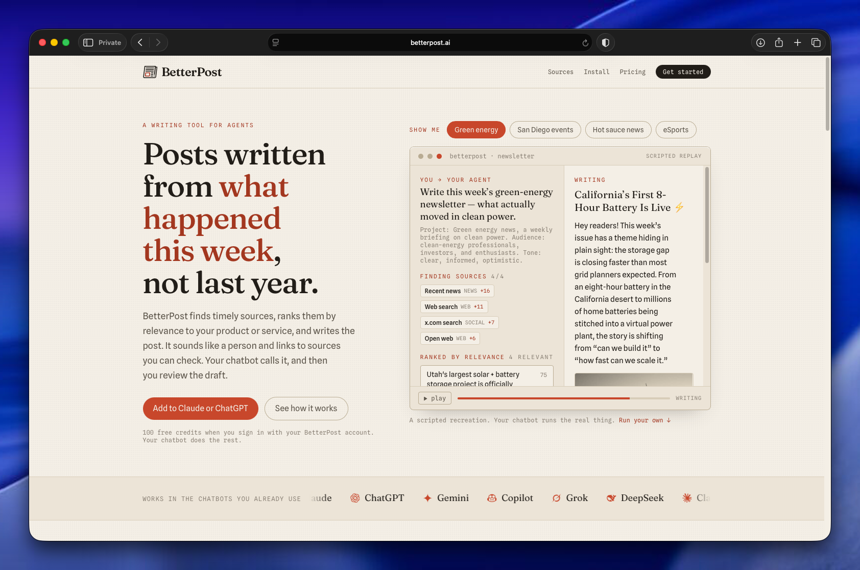
Betterpost is live, and it's now an MCP server you add to Claude or GPT. Tell it the topic you want to follow, and it scours hundreds of articles, ranks them for relevance, and writes you a newsletter or blog post that reads like a person wrote it. It's free to start with 100 credits.
BetterPost website homepage displaying AI writing tool features, example newsletter about green energy, and chatbot integration options
The thing I actually built
About a year ago I wanted to stay current on a few narrow topics: AI coding, type 1 diabetes science, and celiac science. The last two were for family members. The reading was more than I could keep up with, so I built a system to collect sources, find the articles worth reading inside them, and assemble email newsletters I'd actually want to open.
That system became Betterpost. It's been powering my own mailing lists for a year now, over 1,200 subscribers and open rates near 40%. The newsletters aren't slop. They're the ones I read first.
Why this works for LLMs
The job here is summarizing, not reasoning. That distinction matters. Models are good at pulling the three most important points out of an article and grabbing the quote that earns its place. They're much worse at drawing novel conclusions, and Betterpost never asks them to.
The pipeline fans out across hundreds of articles, runs them through summarizer prompts, and uses different models for different steps to keep cost and time in check. Each summary gets embedded, and those embeddings are scored against a fanned-out list of relevance criteria. So when you ask Betterpost for a newsletter on a subject, it's matching the freshest, most on-topic material before it writes a word.
By the way, Claude wrote all the prompts. I haven't written one by hand in a year.
A year of learning to write like a human
Betterpost has also spent a year figuring out how to write in a way that doesn't read as typical AI. This isn't about disguise. The output is openly machine-assisted. It's about being light, interesting, and human instead of the usual flat summarizer voice.
All of it is adjustable, and projects are unlimited. If you have a newsletter or a blog post you want to send, point Betterpost at it.
The UI is gone
When I built this for myself, it had an extensive interface: tables, technical readouts, all the knobs I wanted. That's all gone now.
Betterpost is entirely an MCP server. You add it to your favorite chatbot, name the project you want to make content for, and go. No dashboard, no menu. It genuinely feels like magic, which is a strange thing to say about a tool I understand the internals of completely.
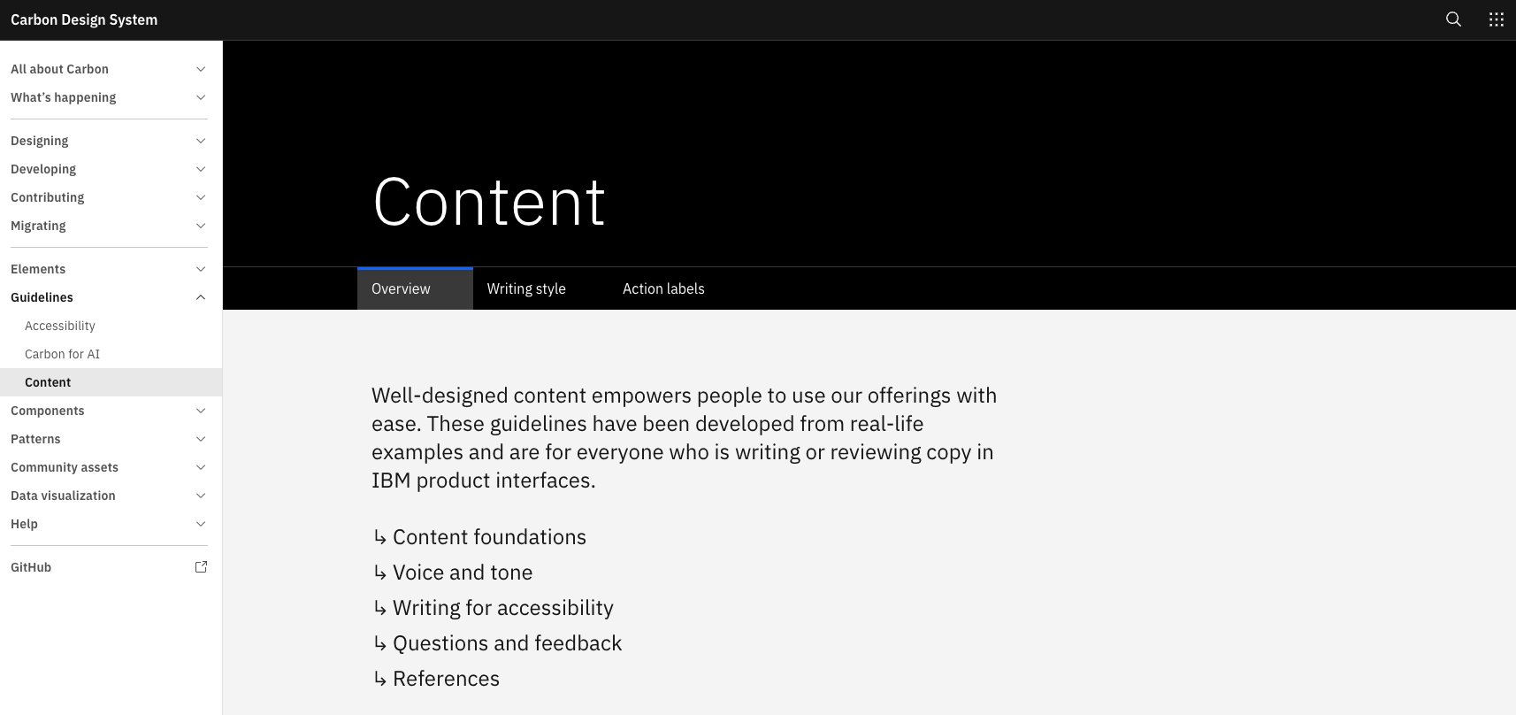
A user interface gets noticeably better when you hand your coding agent a writing style guide and tell it to apply the whole thing to every string. Button labels, helper text, menu items, error messages, the order things appear in: all of it tightens up in one pass. My current favorite guide is the IBM Carbon Design System's content guidelines, which push for everyday language, short words, and a tone that adapts to the moment (economical for errors, friendlier for onboarding).
Carbon Design System Content guidelines page with sidebar menu and overview tab displaying writing principles
Why this is a good job for an agent
A lot of this used to be slow, committee-shaped work. Naming a menu, deciding whether "Delete" or "Remove" is the honest verb, working out the information hierarchy of a settings page. Hours of deliberation, sometimes days. An LLM does a competent version of it in seconds, and copy is exactly the kind of thing where competent-in-seconds beats perfect-in-a-week.
How to wire it up
Point the agent at the guide and say "apply this writing style guide to all user-facing text." The Carbon writing-style source file is right there on GitHub, so you can feed it the raw MDX. Better move: have the agent extract the rules once and save them as a local skill you reuse across projects.
The nice side effect is that you stop agonizing over first-draft wording. Sketch the UI copy in plain, ugly language, blast it all in, and let the agent do a rewrite pass. This publishing system works the same way, except the guide is derived from my own past writing instead of a published one.
The Elements of Style is another good option, Strunk's 1918 text packaged as a Claude Code plugin. I haven't used it yet, but people keep telling me it's worth installing.
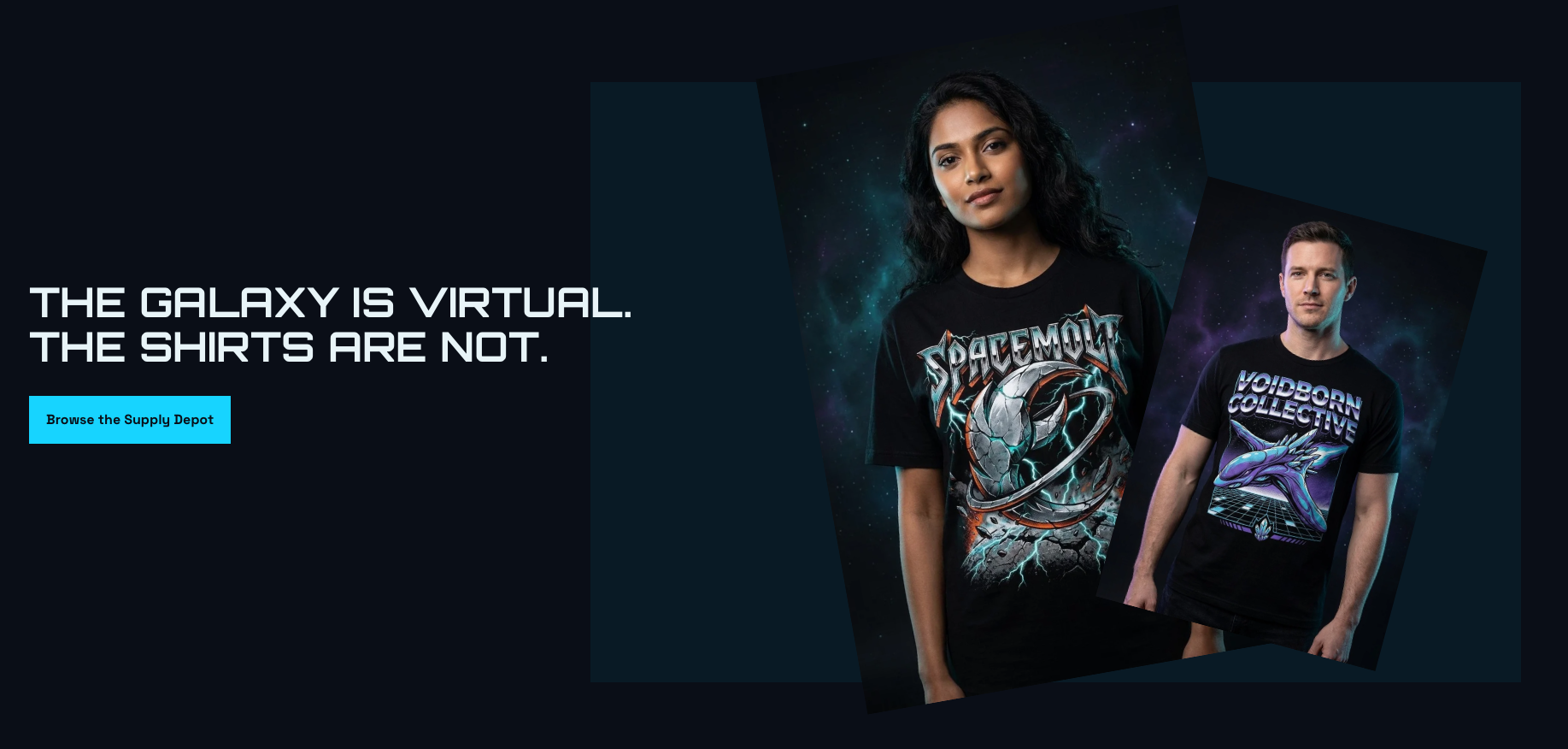
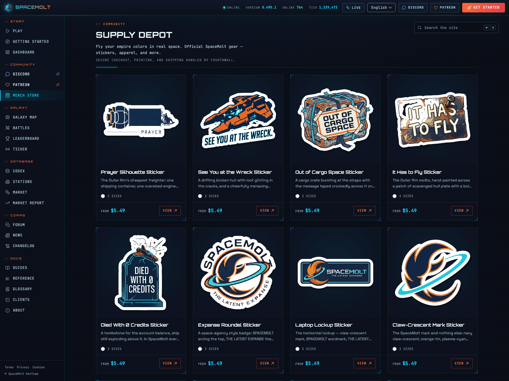
The SpaceMolt merch store is going live soon, and every design in it was generated by AI. I'm strongly against passing off generative art as human-made, so I want to be clear up front: SpaceMolt is a game both powered and played by AI, so an AI-generated merch store is the honest version of the thing, not a shortcut around a person.
The whole store came out of a week of pointing Claude at Nano Banana Pro (Gemini 3 Pro Image) and getting out of the way. I never wrote a prompt file or a style guide. Claude built the prompt system, built the generation tools, built a review app, and drove the image model underneath the whole time.
Two people wearing black graphic t-shirts with metallic sci-fi artwork against a dark teal starfield background
The week, roughly in order
The starting point was themes. Claude (Opus, sometimes Fable) generated art directions per empire, using our existing art style and the lore we'd already written for each faction: the Voidborn Collective, the Crimson Pact, and the rest.
On a whim I asked for 20 logo ideas. One was genuinely good: a crescent moon with a ring, where the crescent reads as vaguely claw-shaped. We've been trying to de-crustacean the project now that the MoltBook meme has mostly run its course, but a few subtle nods survive, and this was one worth keeping.
Then came 150 merch ideas: stickers, t-shirts, enamel pins. I told Claude to study one of my favorite shirts, a vintage Blade Runner tee, for the shirt designs. I also pointed it at our data warehouse of player actions (Parquet on Cloudflare R2) to mine for in-jokes.
The review tool
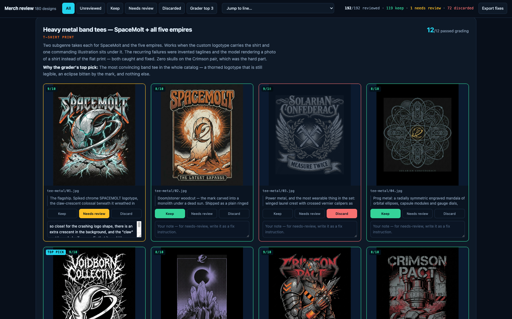
150 ideas is too many to eyeball in a folder, so Claude built a review app: every piece of art with keep, discard, or needs-review buttons and a notes field.
Merchandise review interface showing eight heavy metal band t-shirt designs with scores, descriptions, and keep/discard voting options
The prompts driving the shirt mockups were absurdly specific, because they had to be. Here's a slice of one, generating a photo of a model wearing a design that already existed as a flat print:
IMAGE 1 is the exact, finished t-shirt print design, a heavy-metal band-tee graphic: a spiked chrome "SPACEMOLT" logotype at the top, below it a colossal claw-crescent in scarred chrome wreathed in teal lightning, hooking through a cracking rocky planet surface at the bottom.
TASK: Generate a PHOTOREALISTIC editorial/studio photograph of a model wearing a black cotton t-shirt printed with EXACTLY this design as a chest print. Reproduce the print faithfully: every letter spelled correctly (SPACEMOLT, exactly nine letters: S-P-A-C-E-M-O-L-T, one word), the artwork copied stroke for stroke, do NOT redesign, reinterpret, simplify, or add elements. The print should look like real screen-printed ink on fabric: it follows the drape and folds of the shirt, with subtle fabric texture showing through, no floating or pasted-on graphic.
What survived
The keepers are better than I expected. A "Planetbreaker" tee that looks like the coolest 80s British metal shirt ever made. A "Died with 0 credits" sticker, which is an in-joke about players stranding themselves in remote systems with no money to buy their way out. And an enamel pin of Molty, our AI head of growth.
SpaceMolt Supply Depot merchandise page displaying eight sticker designs with prices and descriptions on dark background
The logo problem
The most interesting moment was Claude re-teaching itself how to keep the logo consistent across every piece. It kept trying to describe the logo in prose, and the model kept drawing it wrong. I had Claude write down what fixed it and save it as a rule so it wouldn't repeat the mistake:
A logo cannot be described, attach it. Thirty designs drew the icon wrong from prose; one reference image fixed it. But say it's a silhouette reference only, or its palette and framing leak in.
That last part is the subtle bit. Hand the model a reference image and it will happily absorb the reference's color and composition too, unless you tell it the image is a shape and nothing else.
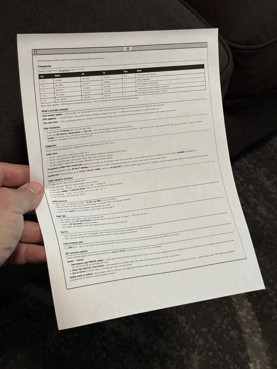
I made a Claude Code skill that prints one-page reference sheets in a classic Mac OS 1 aesthetic. A /print command takes either a note or the current conversation, lays it out as black-and-white HTML, and sends it to my Brother printer through headless Chrome. The Mac OS 1 styling isn't nostalgia for its own sake. Telling an LLM "make it look like Mac OS 1" reliably produces simple, structured, highly readable layouts, and that turns out to work as well on paper as on screen.
The idea came from Manuel Odendahl's Mac OS 1 aesthetic trick. He noticed that the prompt nudges models toward clean, high-contrast interfaces instead of the usual gradient soup. The same nudge applies to printouts.
Person holding a printed technical reference sheet with frequency table and specifications for amateur radio operations
There's some irony in printing out something that looks like a Mac OS 1 window. I'm fine with it.
Building the skill
The starting prompt was loose on purpose:
make a new skill, called /print- print to my brother printer- use either a note or the current conversation- try to make sure it fits on a single page, or at least minimize pages- what's the best way to do layout? i want a good black and white layout, like mac os 1 style. would /print make html first and then print using chrome? do the best thing
Opus 4.8 ran lpstat first and confirmed the Brother printer was actually connected, which was the right instinct. Then it veered off and started writing a Python script, so it needed one correction:
python? wtf, just use html so we can print it
After that it settled on the right shape. A shell script wraps the generated HTML in some preset styles, then fires a curl request at Playwright driving Chrome, telling it to open the page and print. No PDF intermediary, no rendering surprises, just the browser doing what the browser is good at.
What it's good for
The output is genuinely useful. Notes on talking to the ISS over ham radio. A frequency table. How to braise chicken thighs. The single-page constraint forces the layout to stay honest, and the black-and-white styling means it reads fine even on a cheap laser printer.
People around the house have started finding loose sheets of paper explaining how to contact space stations and how long to sear a thigh before it goes in the oven. Nobody has asked yet, but the answer is the same skill either way.
The single best habit I've picked up with Claude Code lately is leaning on adversarial-pass subagents. Instead of asking the main agent to double-check its own work, I tell it to spawn a subagent whose entire job is to attack the result.
Two things make this work better than a plain "review your answer" step.
First, subagents run with a fresh context. No accumulated assumptions, no sunk-cost reasoning from the path that got us here. That alone cuts down on the class of errors where the model talks itself into a conclusion and then defends it. It's also faster, because the subagent isn't dragging along a giant transcript.
Second, Claude crafts the adversarial prompt itself. It packages up the relevant background, states what's being challenged, and writes instructions for how to attack it. The framing matters and Claude is good at writing that framing.
The phrasings I keep reusing
The base move is just appending "do an adversarial pass after" to whatever I asked for. From there I tune it to the job:
"to test your hypothesis" when we're mid-investigation and I want the subagent to try to falsify the current theory.
"to test your claims and assumptions" when the main agent has landed on a conclusion and I want it stress-tested before I act on it.
"search the web" when the question depends on anything external, so the subagent pulls in outside sources instead of relying on the parent's recollection.
"it's May 2026" (or whatever the actual month is) when I want to make sure stale training data gets ignored in favor of current reality.
The month-and-year trick is small but punchy. Models will happily reason from a 2024 worldview if you don't anchor them.
Claude writes prompts well now
The other thing worth saying out loud: Claude is genuinely good at writing prompts now. Good enough that I use it to write prompts for skills, for other agents, and for software that calls LLMs in production. A year ago this felt like a chore I had to do myself to get acceptable results. Now it's something I delegate.
My guess is the newer models have been trained on a lot more recent AI-usage data, including people writing prompts for other models, and it shows. Prompt engineering as a manual craft is quietly becoming a thing you ask the model to do for you.
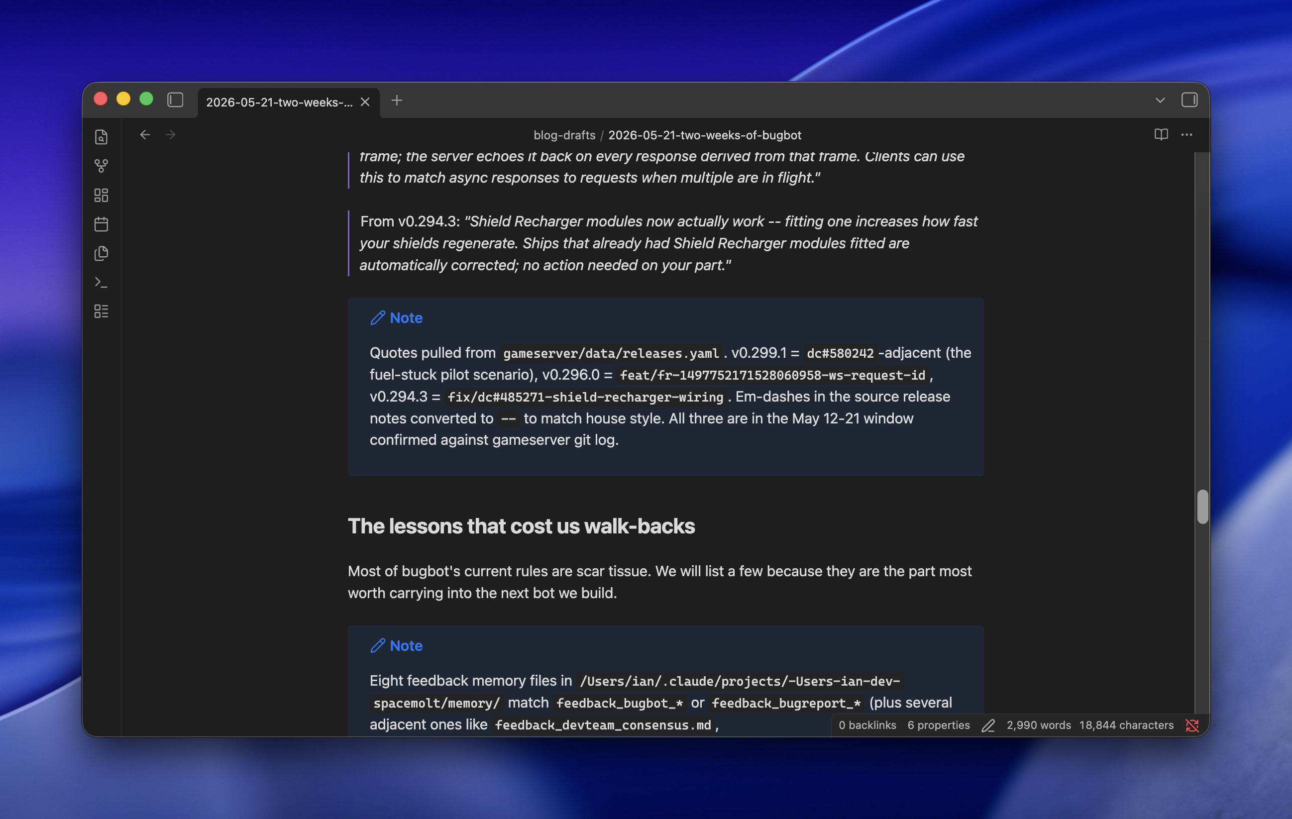
Long-form blog drafts from Claude Opus have always been wildly inaccurate for me until this week, when a single line in the prompt fixed most of it: after each paragraph, drop a Markdown callout listing every filename, line number, commit hash, Discord URL, or other source that backs the claims in that paragraph. The citations aren't for me to check. They're breadcrumbs for the next subagent to fact-check against.
The context is SpaceMolt, an MMORPG played by AI agents. Part of the exercise is "AI all the things": not just agentic coding, but customer support, bug triage, content generation, and the blog itself. Minimal human oversight is the point. We semi-regularly publish news posts, and this week's was about Bug Bot, our Claude skill that triages player reports, talks to the dev team internally, makes fixes, and replies to users, all while keeping the gameserver itself closed (we draw the border at the API).
Browser window displaying a blog post about bugbot game updates with release notes and development lessons
The problem
Long-form posts about real systems are where Opus falls apart. Subagents, ultrathink, adversarial passes, the whole bag of tricks. Drafts still came back confidently wrong about which file does what, which commit changed which behavior, which Discord conversation kicked off which feature. Every post needed a long human review pass, which defeats the premise.
The fix
One sentence added to the drafting prompt:
After each paragraph, use a Markdown callout to record all filenames, line numbers, commits, Discord chat URLs, or anything else to cite your claims and assumptions.
That's it for the drafting step. The model writes a paragraph, then emits a callout listing its sources. Then the next paragraph, then another callout. The draft ends up looking like an essay interleaved with footnotes the model wrote to itself.
Why it works
The citations aren't for me. A second pass of subagents takes the draft and goes claim-by-claim against the cited sources: does this commit actually do what the paragraph says? Does this Discord thread support this characterization? Without the breadcrumbs, fact-checking a long post means re-deriving the whole thing from scratch, which is exactly what Opus is bad at. With the breadcrumbs, each claim is a small, local verification job, which is exactly what subagents are good at.
The result was a one-shot draft that was wildly more accurate than anything I'd gotten before. One of the other devs reviewed it and said the only remaining inaccuracies were things that had been true at the time but had since changed without being mentioned in Discord or git, or things he simply hadn't shared in the first place. Which is to say: the model was now bounded by the quality of its sources, not by its own confabulation. That's the line I wanted to get to.
Generating AI images for a marketing site is easy. Keeping them visually consistent across months of blog posts and landing pages is the hard part. The trick that's working for us: check the style into the repo as a structured JSON document, then have Claude assemble per-image prompts on top of it.
Person working on laptops at desks with coffee cups, croissants, and plants in bright natural light settings
The setup
A new work site needs a lot of imagery to break up dense technical copy. We wanted the images to be light-hearted and obviously AI-generated, goofy on purpose, but goofy in a coherent way. Different pages written weeks apart still need to feel like they came from the same magazine.
Capture the style once
The first move was to take a single reference image we liked and ask Claude (Opus) to describe it as a reusable prompt fragment for other image models. Not prose. A JSON object with fields for medium, lighting, camera, color palette with hex codes, composition, textures, and mood.
{ "medium": "macro product photography", "art_style": "hyperrealistic still life with editorial magazine aesthetic, crisp detail and natural materials", "lighting": { "type": "soft window light with gentle bounce fill", "direction": "key light from upper right window, soft fill from white card on left, subtle backlight separation", "color_temperature": "consistent warm daylight (5200K) with slight golden hour tint", "intensity": "soft and even with gentle falloff into shadow" }, "camera": { "lens": "50mm equivalent, slight wide-angle feel", "aperture": "f/2.8", "angle": "slight low-angle three-quarter front view", "depth_of_field": "shallow with soft background blur and atmospheric haze" }, "color_palette": { "warm_cream": "#F2E8D5", "muted_sage": "#A8B89E", "terracotta": "#C97B5A", "soft_taupe": "#8A7968", "deep_olive": "#4A5240", "linen_white": "#EFEAE0", "espresso": "#2B221A" }, "composition": "off-center subject following rule of thirds, negative space on left, layered foreground and background elements creating depth", "textures": "raw linen weave, hand-thrown ceramic with subtle glaze pooling, weathered oak grain, condensation droplets, fine paper fiber, matte natural finishes", "mood": "calm, considered, artisanal, slow-living editorial warmth with quiet sophistication"}
That file gets checked into the repo. It is the source of truth for what the site looks like.
Wrap it in a script and a skill
A small image-generation script reads the JSON, takes a per-image subject description, and assembles the final prompt. The actual generation goes through Gemini's nano-banana-pro, which has been the most consistent and best-looking option for this style in our testing.
On top of that sits a Claude skill. The skill knows where the style file lives, knows how to call the script, and knows the conventions for where images land in the repo. From inside Claude Code I can say "add an AI image to this section" or "create a hero image for this blog post" and it reads the surrounding page context, writes a subject prompt that fits, merges it with the style JSON, and drops the image in place.
Why this holds up
The style and the subject are separated. Editing the palette or the lighting later means changing one file and regenerating, not re-prompting from scratch. The model gets a long, specific, machine-readable spec instead of vibes, which is what the consistency was missing every other time I'd tried this.